OwlPay Wallet Pro App
Building Trust for a 42.7% Surge in Transactions
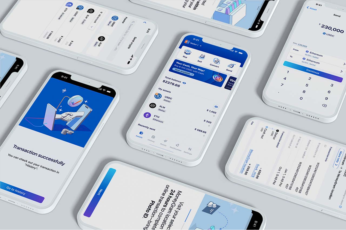
A borderless, real-time transfer wallet designed for seamless global transactions—ensuring asset stability and secure payments anytime, anywhere.
View official website ↗︎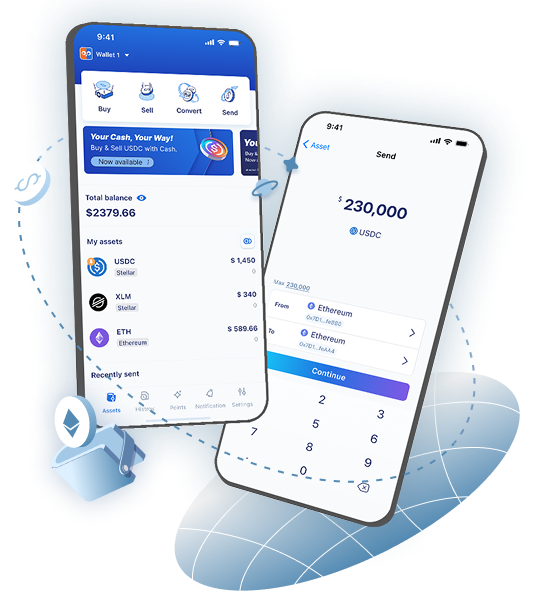
ROLE
TIMELINE
TEAM
DELIVERABLES
Survey design and quantitative analysis
Product DesignCompetitive analysis Low- and high-fidelity wireframes Interactive prototypes Executive presentations Asset production
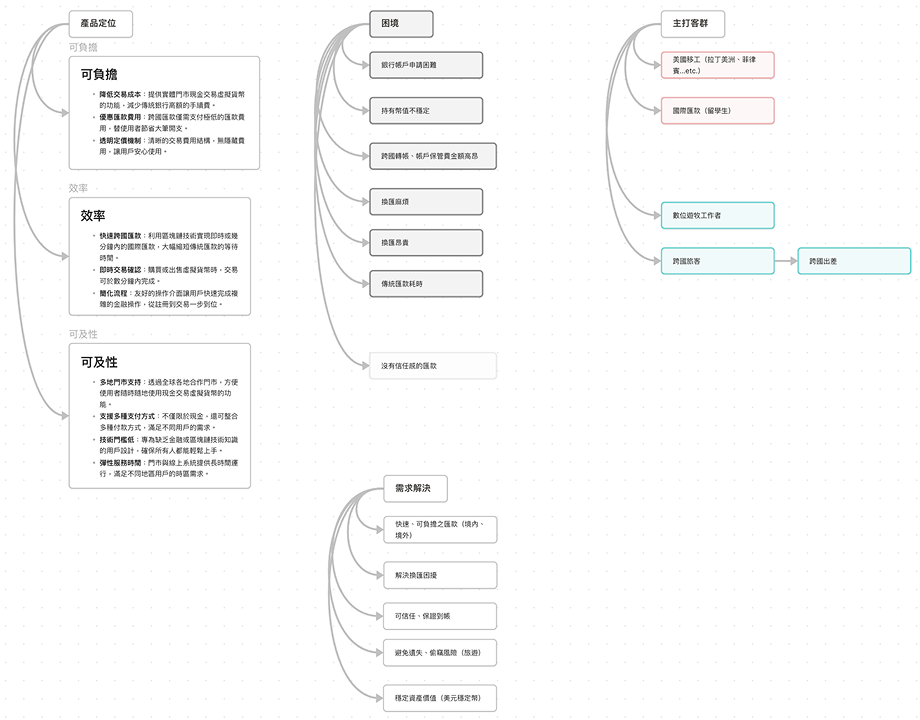
Results & Business Impact
%
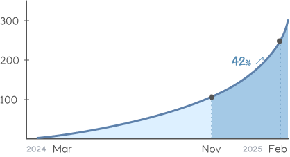
12 months including Dec 2024 – Feb 2025: 334 trades.
100 new trades, a 42.7% transaction growth.
%
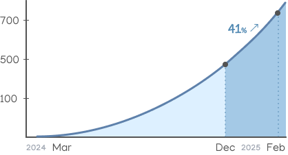
After redesign (Dec 2024–Feb 2025): 747 registrations.
218 new users, a 41% acceleration in user adoption.
Background
Our goal

Information overload in the asset list makes quick decisions difficult.
Users struggle with unnecessary mental load when forced to manually convert currencies.
How did I define the user needs?
Challenge
Conducting user research without direct access to end users. In the Wallet Pro project, I faced three key challenges:

Limited user access

Tight development timeline

Unpredictable third-party dependencies

1. User insight discovery
- Online questionnaire
A short survey targeting potential users with remittance experience, helping validate assumptions about trust, cost, and speed concerns.
Questionnaire responses collected
- Secondary research
Reviewed remittance trends, fintech adoption in Latin America, and challenges reported by migrant communities through articles, user forums, and news sources.
Report collection
- Competitive analysis
We focused on Latin America's most-used bank apps rather than Web3 wallets, since Wallet Pro only supports stablecoin on/off ramps. This allowed us to better understand local users’ expectations for basic transfers, balances, and currency views.


2. Pain points & Product strategy
- Difficult to open a bank account
- High maintenance and cross-border transfer fees, even with a bank account
- Unstable fiat currency makes it hard to preserve asset value
- Currency exchange is complex and expensive
- Traditional international transfers are slow
- Product strategy
With the pain points clearly defined, I worked with marketing and business stakeholders to translate user needs into strategic directions—refining how Wallet Pro could deliver value through stability, accessibility, and simple cross-border transfers.

3. Design principles
Prioritize transaction actions
Key functions like send and convert should always be easy to access.
Display fiat value over crypto value
Users care more about real-world currency than token amounts.
Support multilingual accessibility
Clear language builds trust across diverse user groups.
Make transfers simple and intuitive
Cross-border payments should feel as easy as sending a message.
Why design principles
Design approach
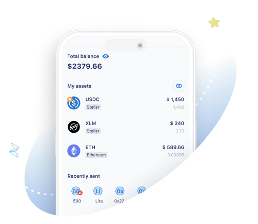
Optimized Asset Display & Transactions for Faster Access
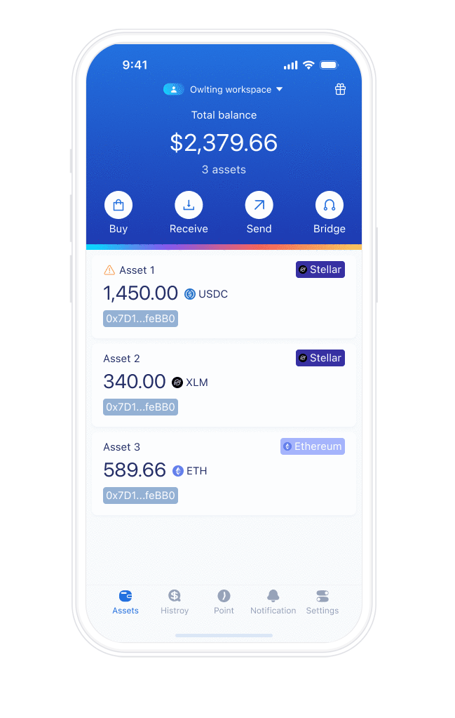
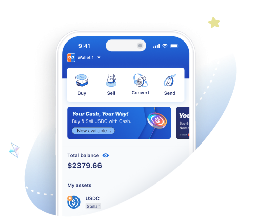
1. Improved Transaction Flexibility

2. Reduced Cognitive Load in Asset Display

3. Optimizing Transfer Flow for Higher Efficiency
Design system
My role
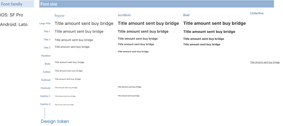
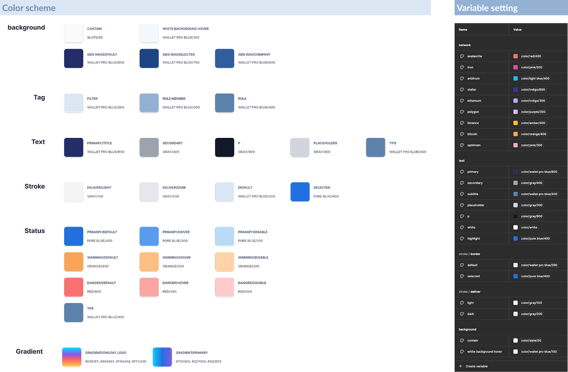
- Defining the full color palette, typography scale, and spacing system
- Aligning token naming conventions with front-end engineers for seamless handoff
- Creating reusable components from atomic elements to full-page templates in Figma
- Converting the icon system into a font set to optimize performance and reduce front-end loading time
Why we built it
- Inconsistent UI patterns across teams
- Repetitive design work
- Miscommunication with developers
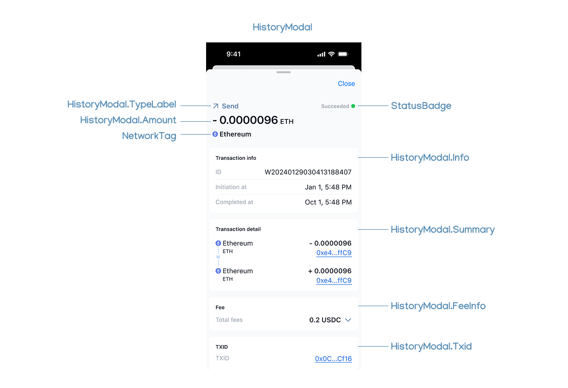
Components
Button

List
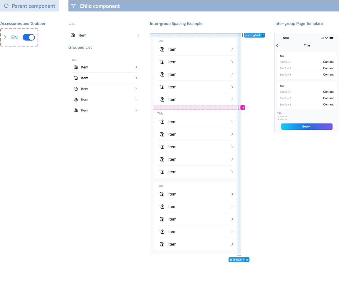
Typography
Color
Handoff documentation standard
Hand-off document example
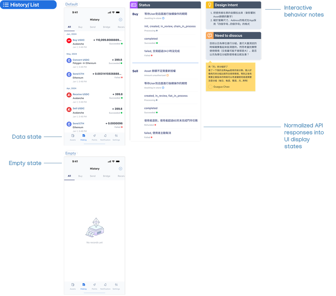
Interactive behavior notes template
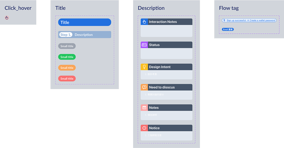
Naming convention
Reflection
This project pushed me to grow not only as a designer, but also as a systems thinker and collaborator.
Without direct user access, I defined pain points through secondary research and stakeholder input. In retrospect, early lightweight validation (e.g. remote testing) would have made our assumptions more robust.
As more designers joined later, the lack of a clear collaboration process caused delays and inconsistencies. I often had to review and refine others’ work before handoff, revealing gaps in both design-to-dev and peer-to-peer workflows.
If I were to lead a similar project again, I would:
Establish a designer-facing checklist or quality gate, similar to engineering QA, to reduce dependency and improve handoff efficiency.
Draft clear design briefs before delegation, ensuring alignment on user goals, constraints, and visual standards.
Facilitate earlier alignment rituals (e.g. kickoff, mid-review) to create shared ownership across the team.
This experience reinforced the value of not only building great designs, but also designing better ways to collaborate.